Last Updated on December 20, 2023 by andrewtk
Landing pages are one of the most critical tools in your lead generation toolkit.
Get them wrong, ain't nobody flowing further down your funnel!
But get them right, and you'll be well rewarded for your time and effort.
I think it's fair to say that there are more bad landing pages out there, than there are good.
I also think it's fair to say that big corporations account for more than their fair share of the landing page mistakes out there.
The important thing to remember is that you can have a landing page that is ninety percent brilliant, and ten percent rubbish…
…and it will not convert!
To really ramp up your conversions, every element is going to need to be on-point.
So let's crack on with this…
The 7 Landing Page Mistakes That Kill Conversions…And How To Fix Them!
#1. Driving all Traffic to the Same Landing Page
I know, I know, it's a ton of time and work to get a landing page up and running.
It's easy to fall into the same trap many online business owners…and it's probably the most common of all the landing page mistakes…
…the trap of building one great landing page, and then just rolling it out for all of your offers, to all of your visitors.
But your offers aren't all the same.
And your site visitors definitely aren't all the same!
Your landing pages should be leading the right people through the right sales journey.
Think of each landing page as a critical part of each perfectly crafted marketing funnel, that is designed to have zero leaks, from top-to-bottom.
Your landing pages are not the opening to a sales bucket where everyone is chucked together, no matter where they came from, or what they are looking for.
Multiple landing pages, all built with different offers and users in mind, will get you way more conversions than a one-size-fits-all landing page.
The solution to this problem is not to build each and every landing page from scratch of course.
The solution is to use a high-quality landing page builder, and work from a base template.
So for each offer and visitor type you are simply tweaking, rather than building from the ground up.
#2. Lame Headlines
Your headlines must capture peoples attention.
If they don't, your visitors will read no further, it's as simple as that!
Great headlines get the value of reading the following paragraph across in just a few punchy, attention grabbing words.
This is not anywhere near as hard as may at first sound. In fact, it's dead easy to sort out!
Just take a currently dull headline, and put a couple of the adjectives, and/or verbs through WordHippo, and you'll get a bunch of suggestions that will give life to your headline.
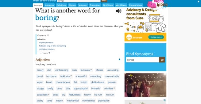
You'll see above, that WordHippo tells me I could switch out the word ‘boring' and replace it with say ‘vapid' which is much more attention grabbing.
Just switching out a couple of dreary words for more exciting alternatives can turn the whole headline around, from dull to attention grabbing.
Have a little fun when crafting your headlines.
You can shock people, you can wow people, you can scare them and anger them.
Every single word in the dictionary is available to you.
The one thing you should never do however, is bait people into reading.
If you suggest in your headline that you will address something specific, you must then do exactly that.
Simple writing bullshit headlines may get you the click but those people will not stick around for long.
#3. Too Many Pointless Visuals
Everyone wants their landing page to look super visually attractive…
…but sometimes an excess of visuals are just pointless distractions that are hurting your conversions.
Most visitors to your landing pages want easily-digestible information.
Every landing page that you create should have a visual hierarchy.
A visual hierarchy guides visitors logically through the page content.
It should keep drawing the visitors attention onto to next essential element of your landing page.
Too many visual elements that do not follow any logical order will do the opposite and keep pulling your visitors attention away from the important stuff.
Here's a great example of a landing page by Udemy Business with a well thought-out visual hierarchy:
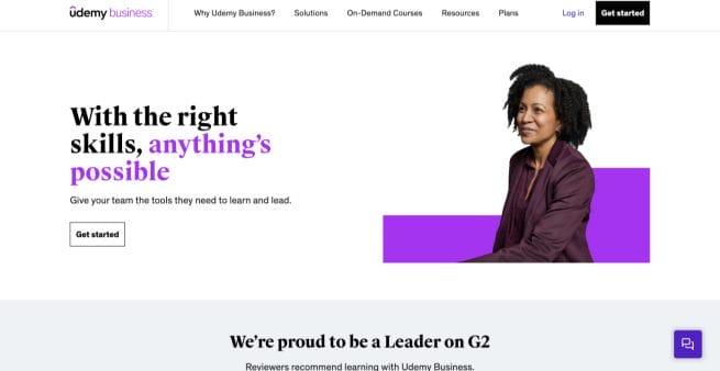
If you clicked through from the link above you'll see how easily the page flows.
They combine vibrant with logical order for great impact that also keep the page visitor focused and reading further and further down the page.
#4. Not Matching Ad Copy with Landing Page Copy
This has got to be one of the most common landing page mistakes made.
When a new visitor click's through from your ad, onto your landing page, they must immediately feel that they have arrived in the right place.
They expect to see the same style of copy, and the same tone-of-voice being used.
If they don't get that feel immediately, they will bounce straight out of there.
Your ad spend just took a totally pointless hit!
When you take the time to align your messages, between ads and landing pages, you'll get many fewer bounces and increased conversions.
#5. Trying to Close Cold Visitors
Each and every landing page that you create, should take into account, where in the buyer decision making journey the visitor is.
If your visitor is just at the information gathering stage, trying to get them to pull the trigger on a purchase is unlikely to work too often.
And for the same reason, if your page visitor is way further through the process, and itching to spend their money…
…a page built to introduce your brand, or product/service, with few opportunities to buy, will get few conversions.
The amount of big global businesses that make this mistake with their landing pages is staggering.
Don't be desperate!
Don't act like you have to get your visitors to buy.
When a landing page is set-up only for closing sales, it will only ever convert the visitors who were totally up for being closed at that time…
…everyone else will be gone!
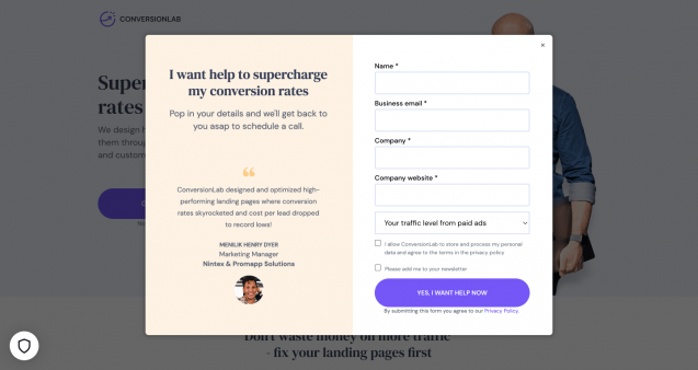
Here's a great landing page aimed at visitors at the start of the decision making process, who are simply looking to information gather on the product and the brand:

This landing page is looking to get the relationship started by offering a free consultation.
And when one of their landing page visitors takes them up on the offer, ConversionLab are going to gather all of their contact details.
Trying to close too soon is one of the easiest of the landing page mistakes to fall into.
So cool your jets a little, build a relationship, don't be desperate!
#6: Not Addressing Buyer Concerns
Your offer may be the best offer the world has ever seen.
But a lot of potential customers will still have doubts about it.
They will want a few questions answered.
And they will want some guarantees in place.
It's human nature.
Neglecting to address the concerns of potential buyers is a big mistake.
Ignore them at the peril of your conversion rates!
The good thing is that it's not that difficult to do.
Some of the most commonly used ways of doing this are through including trust factors within landing pages, such as:
- Customer testimonials
- Customer reviews
- Other third-party feedback
- Money-back guarantee
And just about anything else you can think of that provides that all important seal of approval.
The key is to give some thought about what concerns your target audience might have, and to come up with ways to reassure them.
#7. Generic Call to Action
Well here we are.
Your visitors have flowed beautifully all the way through your perfectly crafted landing page.
And now, they are seriously considering taking some action.
It is now time for your Call-to-Action to work its charm.
Question is…
What colour should it be?
Where should it go?
What should it say?
Try these suggestions as used by some of the best converting landing pages being used right now:
- Position the first CTA in the right sidebar, above the fold;
- Use whitespace liberally around all page CTA's, to focus attention;
- Use a different colour to all other page elements, to set it apart;
- Use offer relevant, action-oriented text;
- Mention the primary benefit in the CTA text, say what they're going to get.
Never make your CTA's generic.
Always make them super-relevant, specific and action-oriented.
Have You Enjoyed Reading This Article?
Want to read some more of my stuff about landing pages?
The Top 6 Best Landing Page Builders
Wrapping It Up!
If you're really going to get your landing pages firing on all cylinders, you're going to have to pay attention to each and every element.
Because for each element that doesn't do it's job as well as it could, a whole bunch of your page visitors disappear, never to return.
It's no big secret…
…the online marketers who are winning the conversion race, are those spending the most time and effort on page design, copywriting, and testing.
Want More Stuff Like This?
Straight To Your Inbox
Then sign-up to thedoublethink free newsletter and get strategies I only share with subscribers...for free!
Thank you for subscribing.
Something went wrong.

