Last Updated on August 28, 2020 by andrewtk
There is a very annoying graph that keeps popping up in Keynote presentations.
Edward Tufte invented the concept of Chart Junk.
His most famous work – The Visual Display of Quantitative Information was published in 1983. It is probably the most important book ever written on data visualization.
It made the top 100 non-fiction books of the 20th century on Amazon.com. It is packed with examples of best and worst practices in the history of data visualization.
Even the book itself is designed beautifully.
Tufte wanted its design to follow the principles it put forward. He therefore decided to publish it himself, having to take a 2nd mortgage to finance it. You have to admire the man’s determination! In this book Tufte laid out his key data visualization principles.
Graphical Integrity
Visual representations of data must tell the truth.
Tufte shows a whole range of graphs that either over or under represent the effects in the data.
He does this by calculating a graph’s Lie Factor which can be calculated by dividing the size of the effect shown in the graphic by the size of the effect in the data.
If the Lie Factor is greater than 1 the graph overstates the effect.
Tufte goes on to list the following 6 principles of graphical integrity:
- The representation of numbers, as physically measured on the surface of the graph itself, should be directly proportional to the numerical quantities represented
- Clear, detailed and thorough labeling should be used to defeat graphical distortion and ambiguity.Write out explanations of the data on the graph itself. Label important events in the data.
- Show data variation, not design variation.
- In time-series displays of money, deflated and standardized units of monetary measurement are nearly always better than nominal units.
- The number of information carrying (variable) dimensions depicted should not exceed the number of dimensions in the data. Graphics must not quote data out of context.
Here is one of Tufte’s examples of a graph with low graphical integrity.
According to Tufte the Lie Factor of this graph is 14.8. A numerical change of 53% is represented by a graphical change (size of horizontal lines) of 783%.
Data-Ink
Data Ink is the ink on a graph that represents data.
Tufte claims that good graphical representations maximize data-ink and erase as much non-data-ink as possible.
He put forward the data-ink ratio which is calculated by 1 minus the proportion of the graph that can be erased without loss of data-information.
He puts forward the following 5 principles related to data ink :
- Above all else show data.
- Maximize the data-ink ratio.
- Erase non-data-ink.
- Erase redundant data-ink.
- Revise and edit
Tufte tests these principles on a whole range of examples to come up with a wide range of fresh designs that dramatically improve the legibility of the graphs.
Here is an example with a very high data-ink ratio.
The above is an electroencephalogram – a graph that records the electrical activity from the brain.
This graph would have a data-ink ratio of 1.
Chartjunk
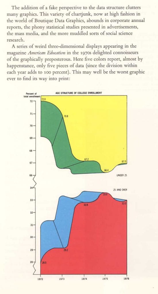
Tufte has a whole chapter dedicated to what he calls Chartjunk – the excessive and unnecessary use of graphical effects in graphs.
He calls out moiré vibration, heavy grids and self-promoting graphs that are used to demonstrate the graphic ability of the designer rather than display the data.
This is according to Tufte possibly the worst graph ever:
Data Density
The data density of a graph is the proportion of the total size of the graph that is dedicated displaying data.
Tufte prefers high data density graphs.
He wants us to maximize data density and the size of the data matrix within reason.
One way of achieving this he claims is through the Shrink Principle. He claims that most graphs can be shrunk way down without losing legibility or information.
Small Multiples
Small multiples are series of the same small graph repeated in one visual.
Tufte says that small multiples are a great tool to visualize large quantities of data and with a high number of dimensions.
Below is an example that uses Tufte’s spark-lines to create a graph of small multiples.
According to Tufte spark-lines are data-intense, design-simple, word-sized graphics.
Here is an example of how they are use to show movement in stocks.
This graph has pretty high data density as well.
Important Note:
I take no credit for the production of this post. It was the work of the previous owner of this domain.
I decided to re establish it on the my site because I was receiving regular requests from people who were searching for it with the old URL.
Good work previous domain owner. People love this post enough to email me about it almost daily.
Want More Stuff Like This?
Straight To Your Inbox
Then sign-up to thedoublethink free newsletter and get strategies I only share with subscribers...for free!
Thank you for subscribing.
Something went wrong.


